

The Movist app helps users manage their film and television collections. Though visually-appealing, my use of the app left me frustrated with its poor user experience. I was compelled to test how I might improve the app through an unsolicited redesign.

User Research and Design for Existing App (Unsolicited)
Project Details
4-week unsolicited redesign
My Role
All aspects of project
Team
N/A (solo project)
Methods
Directed interviews, moderated usability tests
Tools
Balsamiq, InVision, Illustrator, Photoshop

Problem
Movist has potential: it’s attractive, lets users keep track of what they've watched, taps into IMDB's database, and...well...did I mention it looks nice? Unfortunately, the problems become immediately apparent when you start adding titles, organizing your library, sorting, and... well... generally trying to use the app. It's clear that less time needed to be spent on the visual design and more on the actual user experience.
Rethink
As a user myself, I began this redesign with my own ideas for improvement. But I didn't want to design from me-search, so I recruited some media-collecting users. I wasn't surprised that most of my own frustrations were mirrored by those who tested the original app. But the usability tests revealed an additional problem I hadn’t thought about: the app’s “one size fits all” design alienated some of its potential users.
Result
While the general visual design was retained, hidden features were brought forward, affordances were made more obvious, flows were simplified, and most importantly, new features were added so users could tailor for their own unique needs. This included adding multiple user profiles to one database, allowing customization of metadata, and including features specifically for households with children.
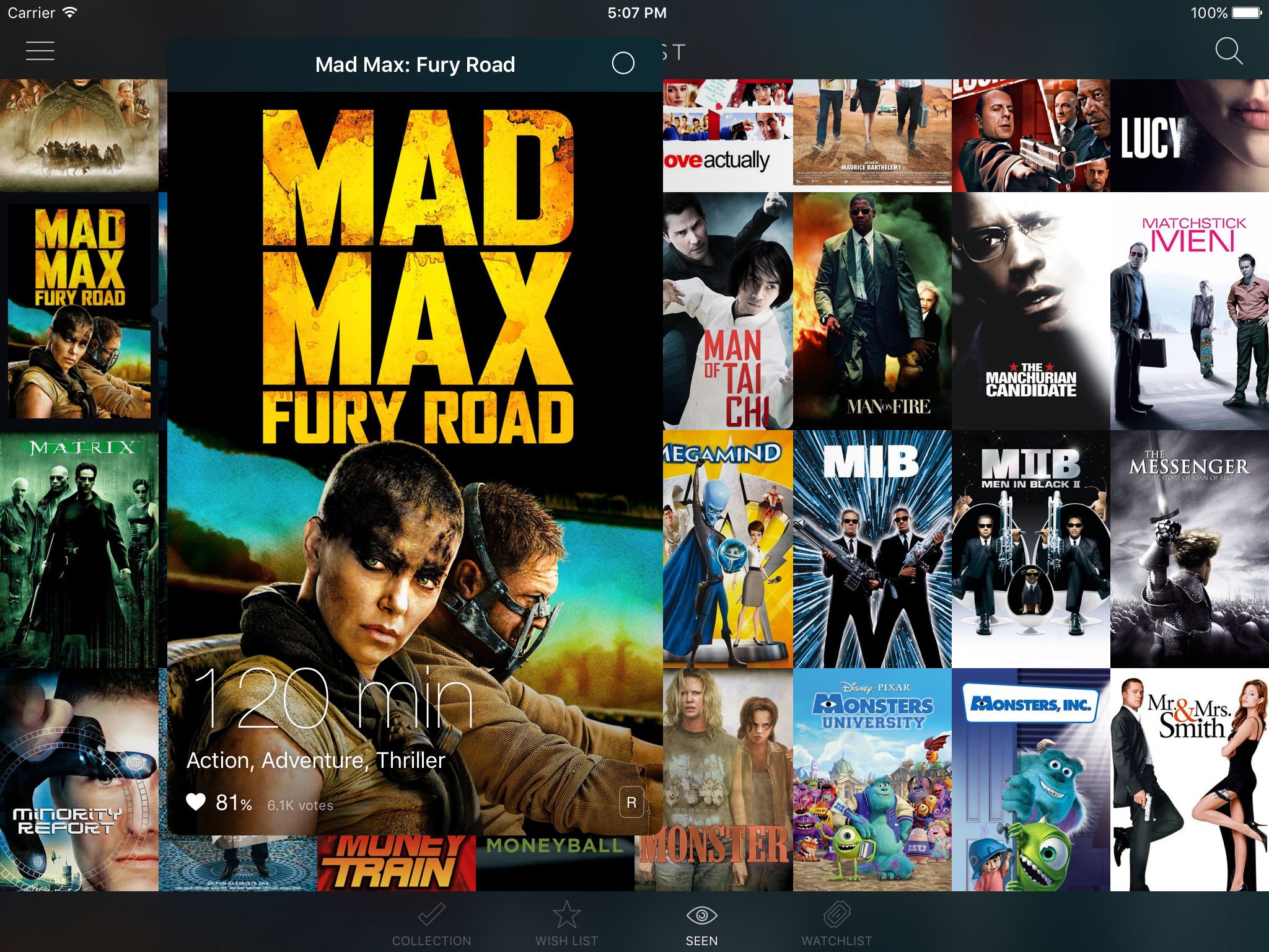
Screens I created for the latest hifi prototype redesign.

Corroboration with a Side of Learning a Thing or Two (or Three).
To better understand how users might use the app, I interviewed six film/television collectors. While all of them owned a large number of film and episodic shows, none of those I spoke with had ever used the Movist app before.
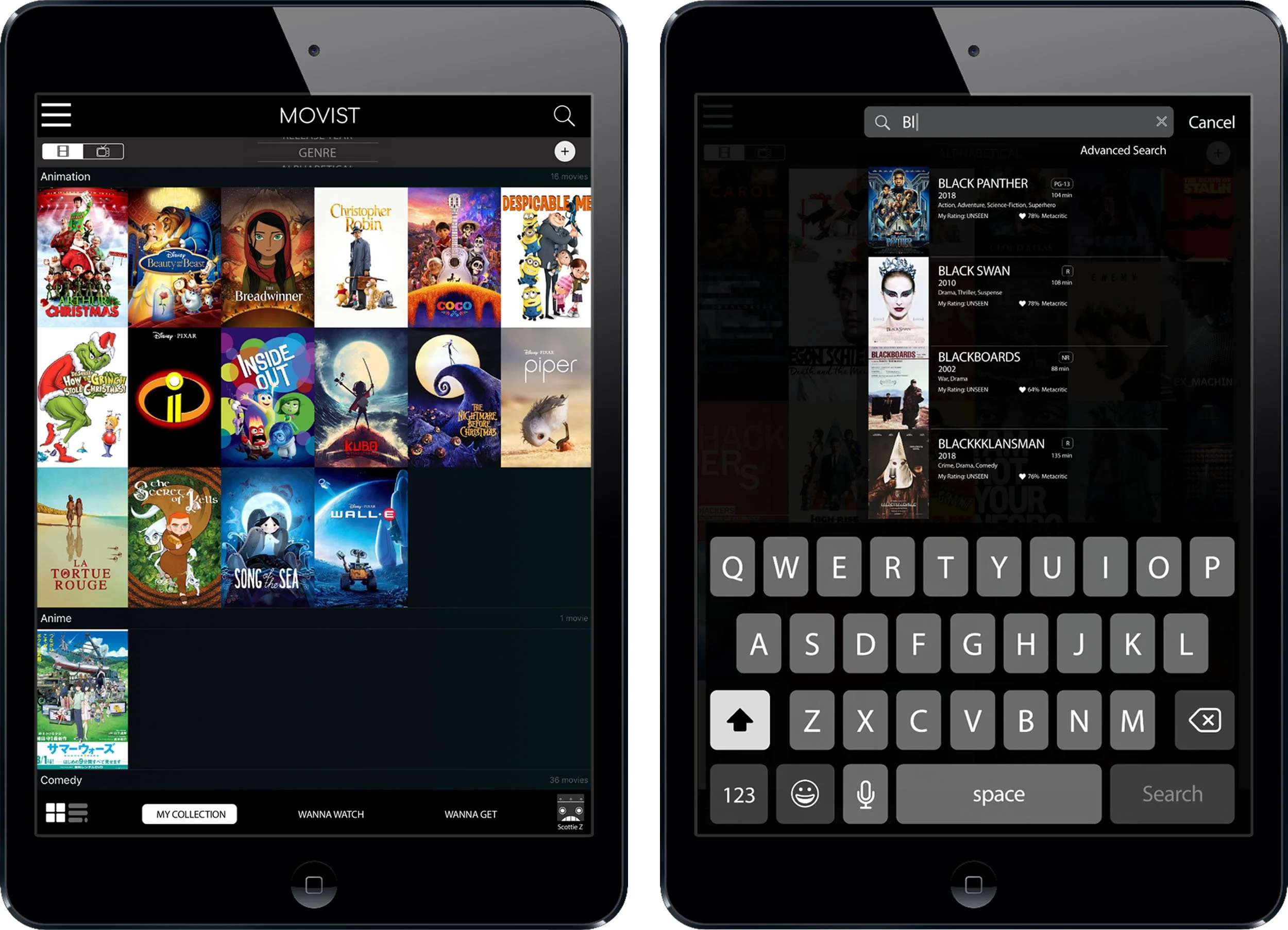
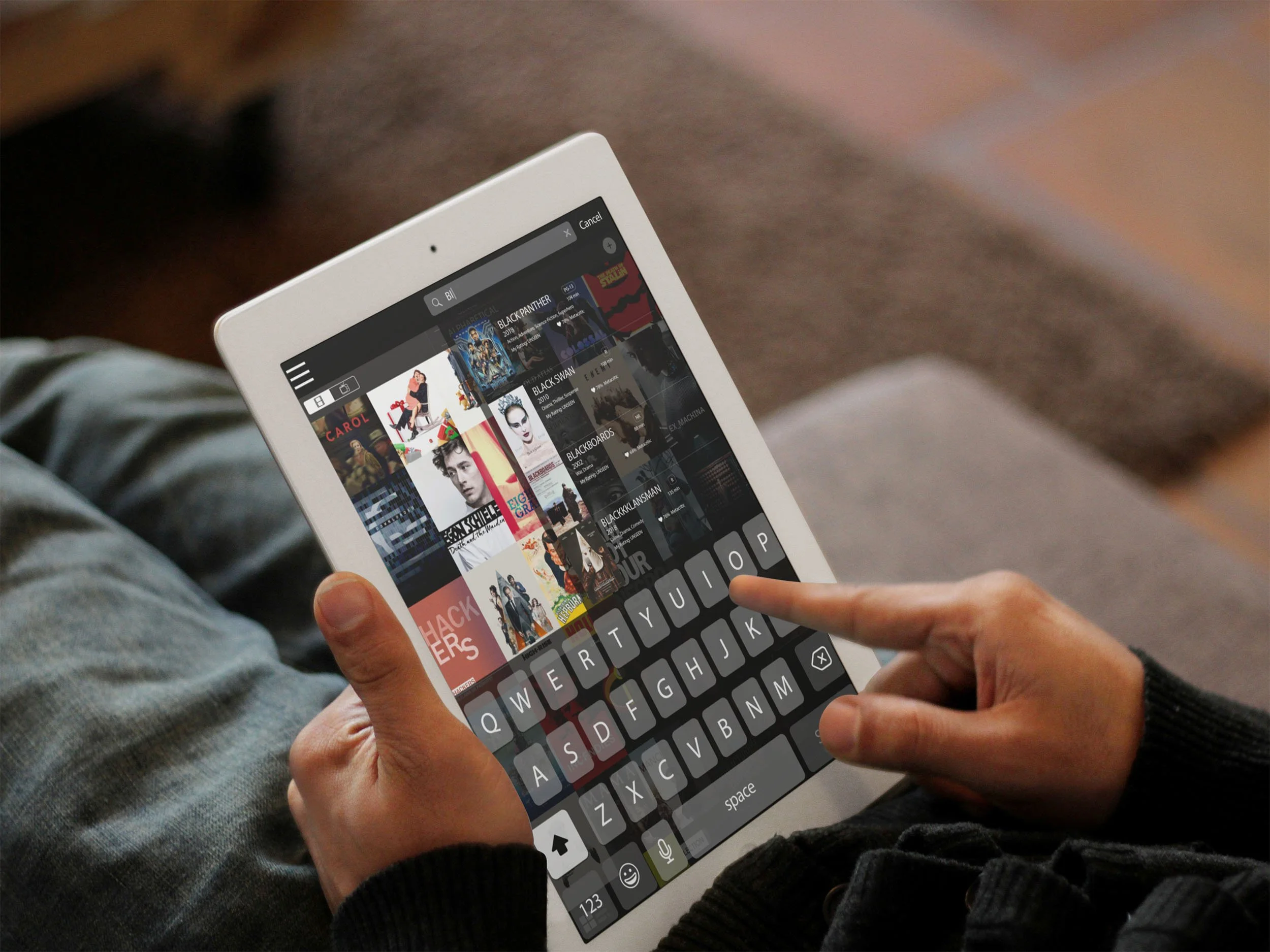
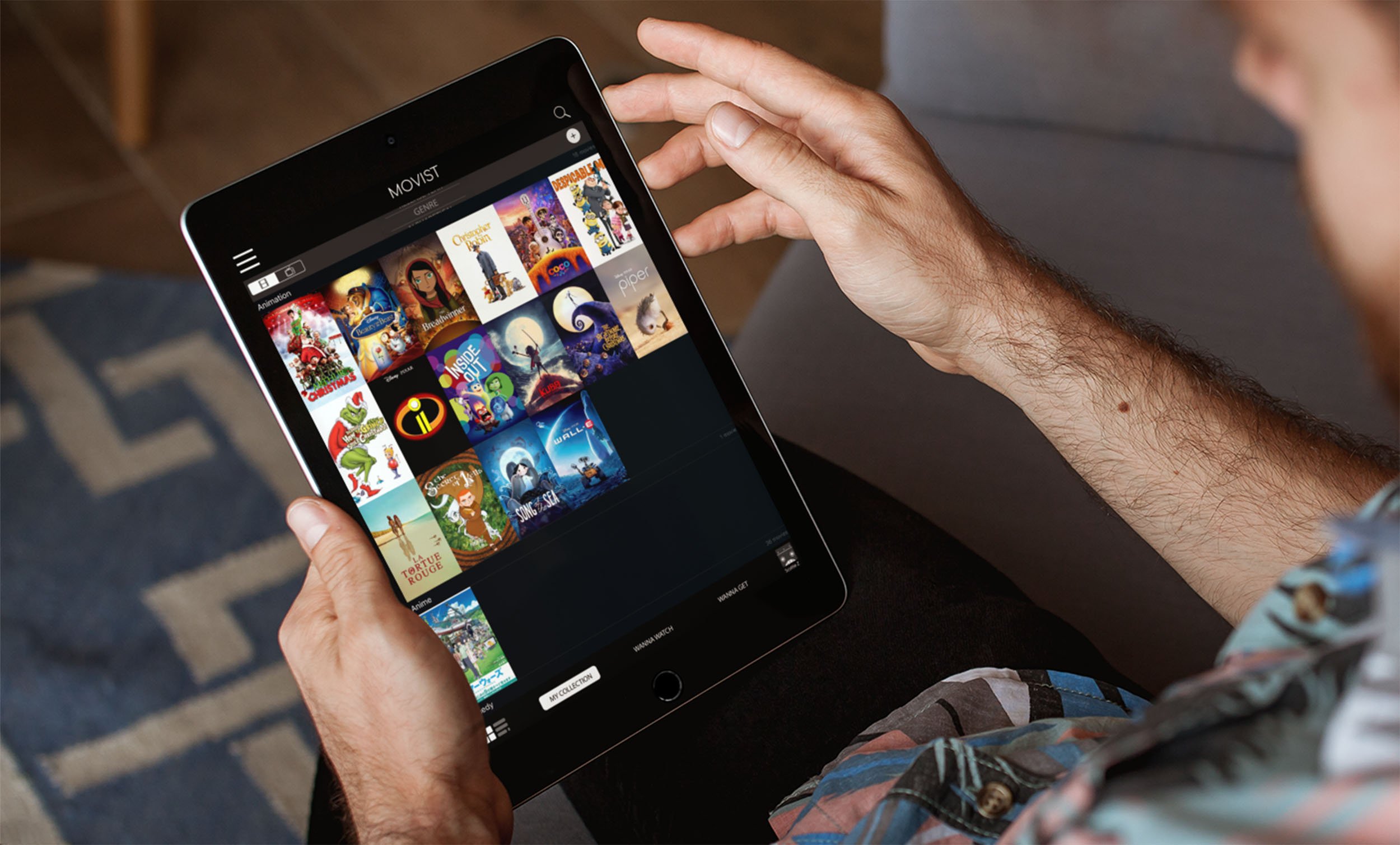
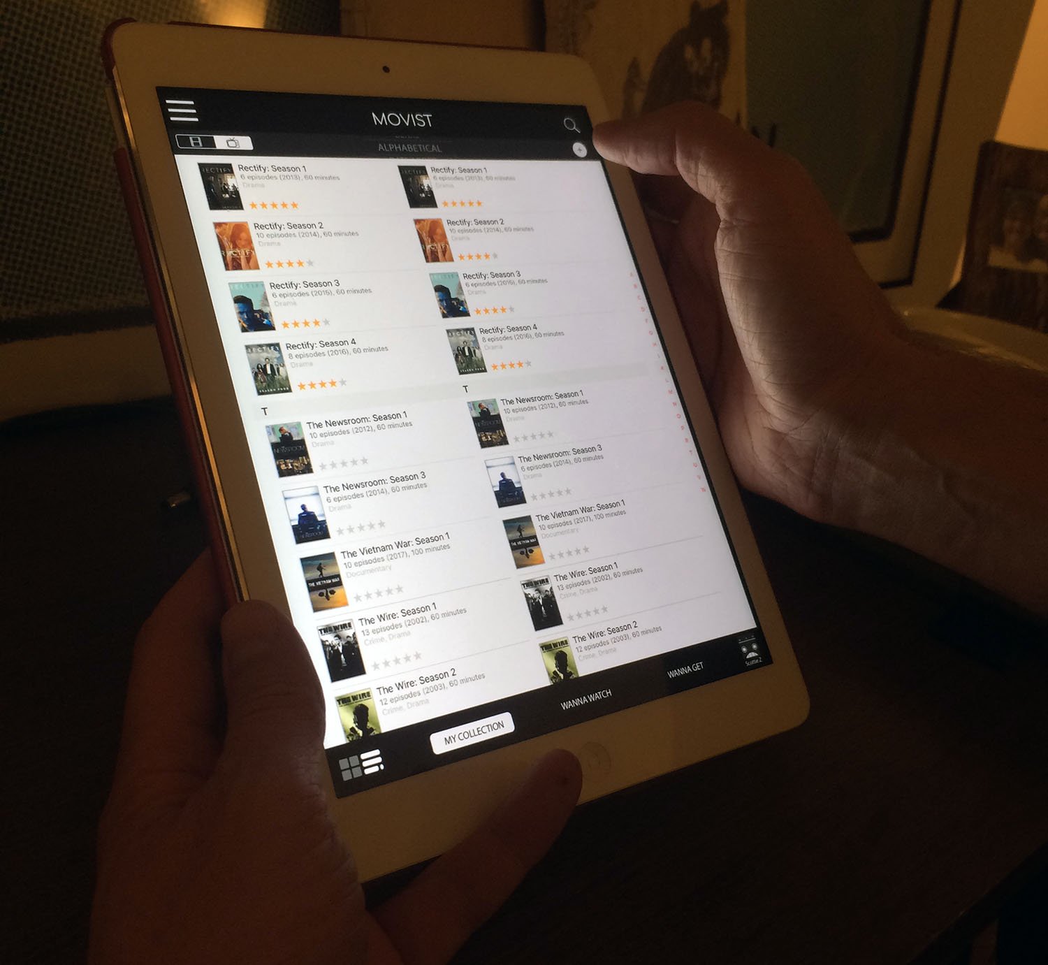
Screenshot of the original (tablet) app.
One Size Does Not Fit All
In order to validate my assumptions as well as to identify additional issues regarding their experience using the original app, I incorporated several app-based tasks into the initial interviews.
Not surprisingly, everyone expressed frustration with their inability to quickly complete some of those assigned tasks. A few weren't even able to find some of the necessary features important to complete a task.
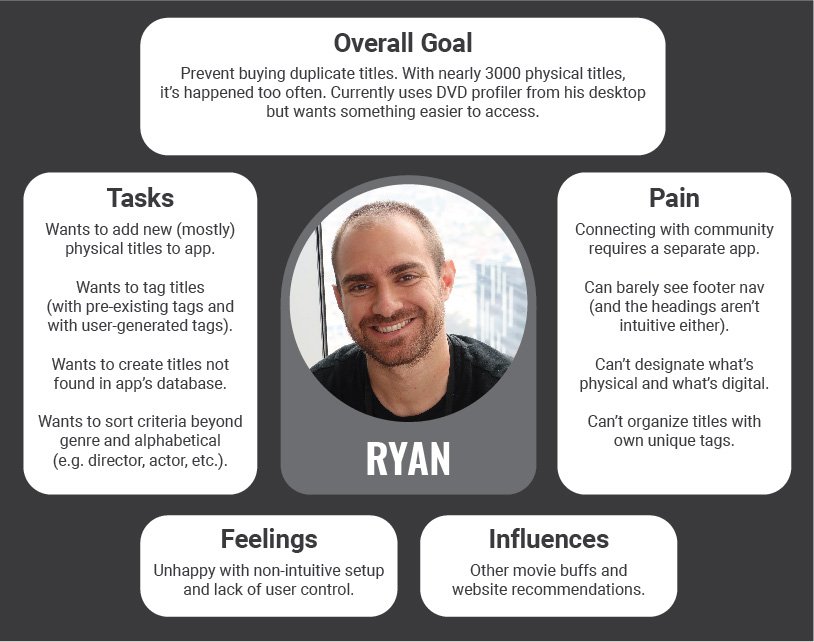
The serious collector who accidentally buys duplicates.
But I also learned about important concerns users had regarding how the app would address each of their own unique situations, from having a massive library to sharing the app with a partner or young children.
So, to help guide my redesign decisions, I created three empathy maps based on these concerns.
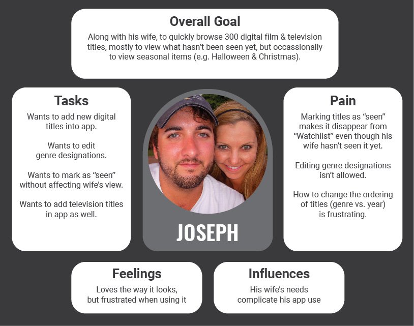
The couple that wants to share the app… but can't.
When the Beauty Bias Grants Forgiveness to an App
Based on the vocal and body cues I was witnessing during testing, I assumed everyone hated the app. But when I asked at the end of each usability test if Movist was something they would use again, every single one of them surprised me by answering "yes."
Although they experienced frustration during the tasks, they still wanted to give it another go because “I like the way it looks.”
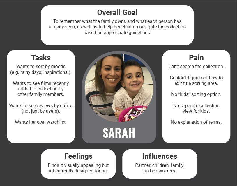
The parent who wants control of what young kids can access.

I wanted to quickly test if some possible solutions I had in mind would alleviate some of the user frustrations I was hearing, so I threw together a rough lofi protoype and went back to the same users who had tested the original app.
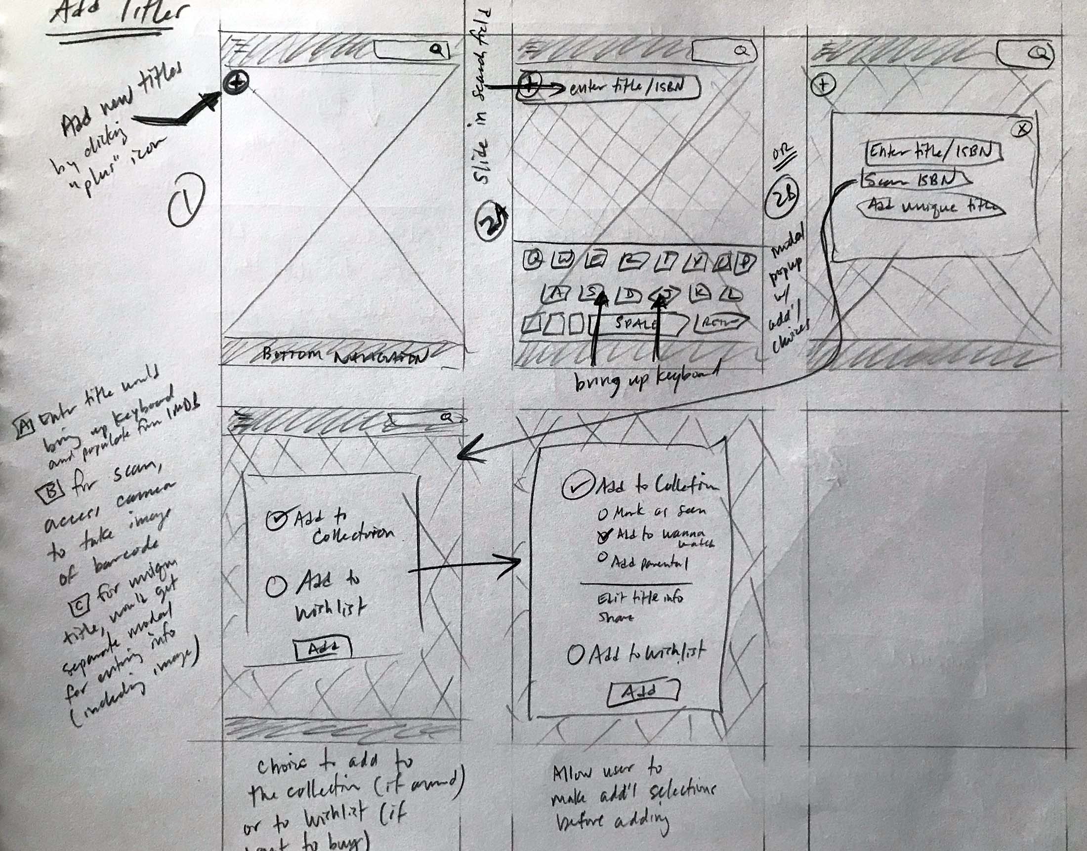
Sketching out new ways to add titles to Movist.
When They've Already Fallen for a Look
After falling in love with the original app’s visual design, it took some coaxing to help users get past the minimal prototype I wanted to test.
But after encouraging them to focus not on the visual design but on the tasks themselves, every user was able to complete tasks much faster than the original app.
While doing so, they also revealed some specific pain points with this version of the prototype around issues of visibility, nomenclature, and flows.
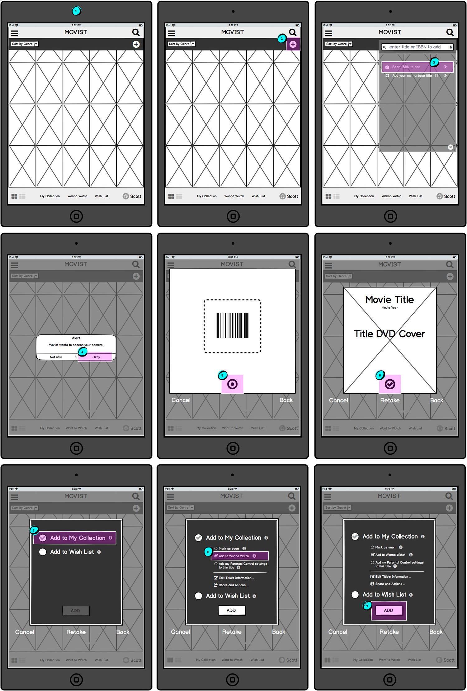
A basic wireframe I created in Balsamiq.
Users Liked
the new sorting feature.
the intuitiveness of searching titles.
the ability to customize their titles.
But…
some terminology was still unclear.
required too many clicks to change profiles.
some new features weren't seen.
Microinteractions and Stealing Borrowing Visuals
To avoid the type of resistance I encountered around the visual design of the prototype, I decided to jump right into a hifi design for the next iteration, incorporating changes informed by the first round of testing.
Because this was a fast turnaround, I relied heavily on screenshots I had taken from the original app as well as images taken from other sources. (Yes, that really is a user icon from Netflix.)
Microinteractions were added to the latest hifi prototype I tested.
I also added microinteractions to the InVision prototype to see how users would react to the movement and various opportunities to explore and play.
This prototype proved much more successful with users. They were able to complete tasks faster since hidden features were brought forward and flows were simplified to reduce the number of clicks required.
Aside from a request to have additional reviews from critics attached to titles, the most relevant and common complaint was around terminology and icons, particularly in the bottom tab bar and within title card view (both front and back).
Users Liked
the simplicity of changing profiles.
the interactive selector for sorting.
the toggle switch for title views.
the ability to search their library.
But…
there was still disagreement about some terminology/icons.
some users wanted reviews from critics (e.g. Rotten Tomatoes).


Nomenclature & Icons
Continue to test other name and icon possibilities for better clarity.

Edit Information
Test for customization of title cards, including images and tags.

Sharing Reviews
Work out and test how users can share their own reviews within the app.

New User Testing
Gather new data from users who haven't seen previous prototype iterations.
Reflections
Unlike with the original testing, users had no difficulty completing tasks with the latest version of the prototype. Even when users couldn't describe how to do something without the app in front of them, they were able to successfully perform the necessary steps when they had the app in their hands. What's more, users were pleased with the added features around multiple profiles, parental controls, and customizations.
However, because these users already had familiarity with the app over the course of three tests, I would like to gather additional data from new testing subjects in order to confirm that the revised user flows are intuitive for new users as well. Additionally, terminology and icon choices continue to be problematic, so testing for better words/phrase choices will be necessary.
Currently, the app pulls information from IMDB to populate title information, including user ratings. Given more time, I would begin wireframing and testing for both the "Edit Information & Add Preferences..." and "Share..." features. This would involve the ability for users not only to create searchable tags, choose alternate title images, and edit title information (e.g. setting dominant genre classifications, etc.), but also to add and share their own personal reviews/ratings with other Movist users as well.
Below are just a few of the changes I made, presented in a side-by-side comparisons with the original Movist app.
To see a walkthrough of the latest redesign, view the video near the top of this page.
Home (“My Collection”) Screen
I retained the visual design due to positive user response but...
Improved tab bar visibility.
Forefronted sorting feature.
(NEW) Added list view toggle for those who didn’t recognize the movie thumbnails.
(NEW) Added film/TV toggle.
(NEW) Added user profile for multiple users.
(NEW) Added "+" icon for users to "Add to Collection."
Changed magnifying glass from "Add to Collection" to "Search My Collection" to fit users’ mental model.
Sorting the Collection
One of the biggest frustrations for users was figuring out how to sort the Collection.
Originally the user needed to long-press on one of the links in the tab bar to open this feature.
Changed the sorting feature to a selector and brought it forward to the home screen for a more intuitive and enjoyable user experience.
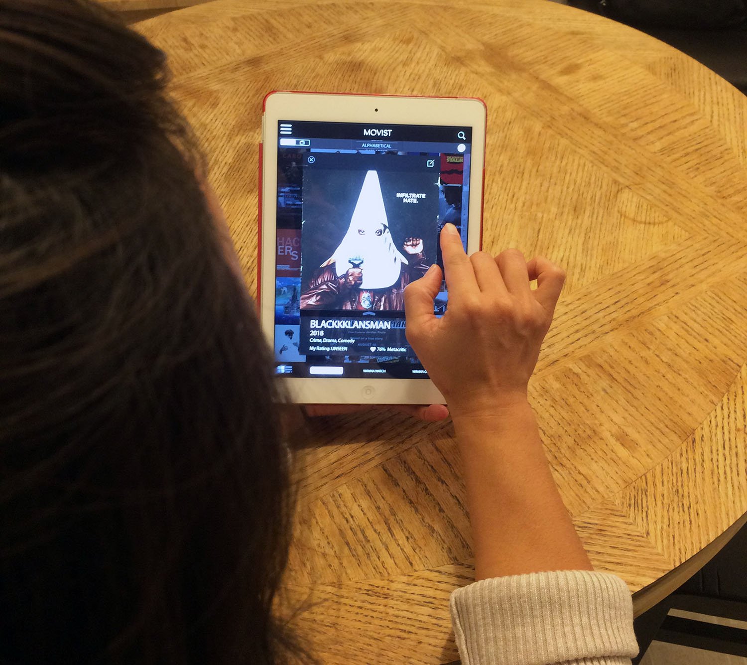
Title Card (Front)
Title views and their affordances weren't always legible or understood during testing.
Improved visibility by darkening the background when users bring up a (now centered) title card.
Added the standard "x" to better indicate how to close title cards.
Replaced overlooked and misunderstood circle icon with "Flip to Edit".
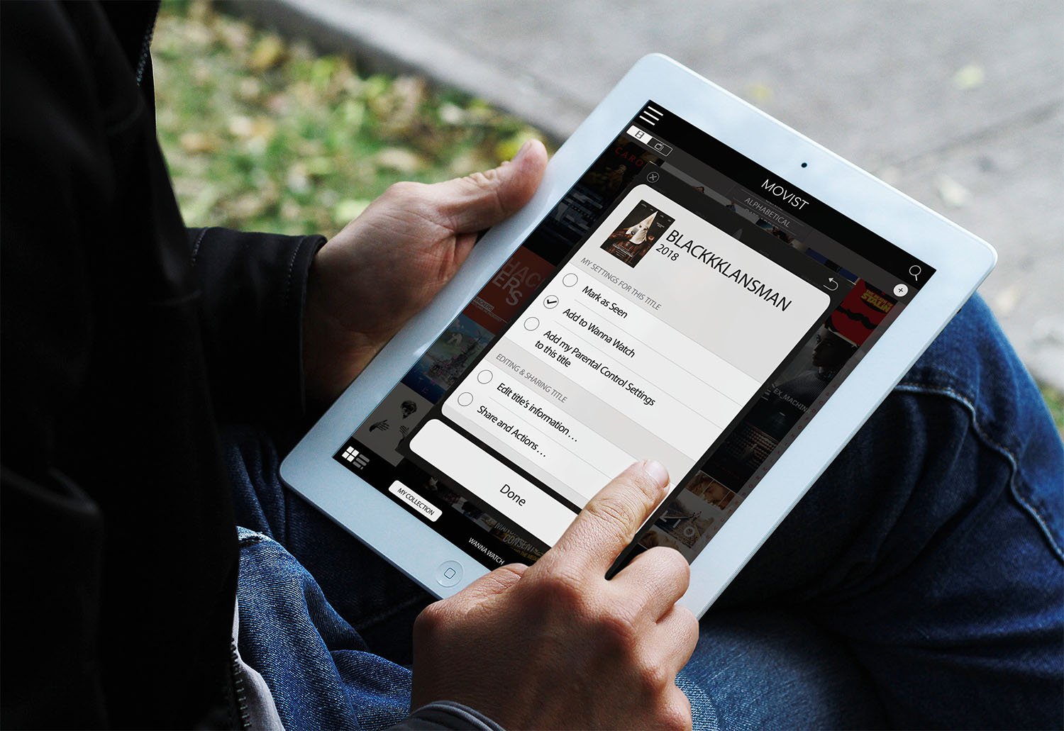
Title Card (Back)
Editing Title Cards caused great frustration for users since the cards would automatically close after each change users made to them.
Included a "Done" button so users could make multiple edits at a time without having to reopen the Title Card.
Added additional customization, including parental controls, format types, and personalized edits.
Zephyr Swart
User Research
Interaction Design
Service Design