

We wanted to design a digital experience that helped budget-conscious people "expand their horizons." Discovering and learning new activities from the numerous and disparate online sources often overwhelms people. Wouldn't it be better to gather together these various resources into one place in order to better guide exploration, as well as offer assistance with goal-setting, tasks, and reminders?

User Research for a Mobile App Concept
Project Details
10-week conceptual (college) project
My Role
Team lead, secondary and primary research, usability testing, concept video creation
Team
Calvert Hou, Julia Engfer, Kendra White
Methods
Interviews, moderated usability tests
Tools
XD, Illustrator, Photoshop, After Effects

Problem
Many of us often stick to our usual routines and habits... even as we complain about feelings of boredom and discontentment. And when we do finally take the leap to learn something new on our own, we can quickly feel lost, either because we don't really know what new things might interest us or because we keep going down never-ending digital rabbit holes.
Rethink
Initially, we intended to focus on people having difficulty finding new interests outside of their work. But our interviews uncovered a surprising subset of people who were attempting a career change on their own. They knew what interested them but they were getting overwhelmed by information overload. It became clear we also needed to consider options for structured learning.
Result
Horizon prioritizes ways to discover interests based on inputs and app exploration. For those who are consumed by indecisiveness, users can even let Horizon make decisions for them. Once an interest is chosen, the app can then help set goals, structure tasks into manageable chunks that build on one-another, send reminders, and provide motivation and positive feedback.

Hifi prototype screens by Hou.

I created this conceptual video to illustrate how Horizon helps users discover new interests.

Expanding Your Horizons.
Or: How I Learned to Stop Worrying and Love Ambiguity.
As part of a team effort to build empathy, I interviewed five full-time employees to better understand not only how people spent their time when away from the workplace but also how they felt about what they were doing when they weren't working.
We paused and stumbled quite a bit at the outset of this project, burning through a box of post-it notes as we attempted to identify patterns from these initial interviews.

Trying to make sense of the data from our interviews.

A Case of the Stuckies
It wasn't simply that most interviewees reported feeling "stuck"; it was also the fact that they exhibited feelings of embarrassment and shame as they admitted to spending their spare time simply watching and listening to various media.

I created the Ian Persona to describe the type of user needing help finding interests.
“It would really be nice to talk to my family and friends about something other than work and TV shows.”
While they responded positively to the concept of "trying something new," nobody knew where to begin since none of them were sure what they were interested in doing... well, none of them except for the "Winnies."
A Case of the Winnies
Winnie was a resulting amalgamation of unexpected interviewees that appeared to be vastly different from the other people we spoke with. In the middle of a career change, the Winnies already knew what they wanted to do and were attempting to use free online resources to learn on their own.

I created the Winnie Persona based on users needing guidance.
“I don’t have the luxury of having a career coach or guidance counselor telling me what to do.”
At first, we debated disregarding the Winnies since they didn't appear to fit the patterns we were seeing with the other interviewees. But the more I explored the resulting interview data, the more I began to see a shared problem: both groups felt overwhelmed by what was out there.
Consequently, I was able to identify and coalesce sets of needs into two distinct personas that could help guide the team during prototype-building.

Explaining to the team how we might simulate a lofi XR.

As a way to further inform prototyping, I had looked at online tools that help people discover ideas and learn, including YouTube, Pinterest, and free online courses as well as IRL and AI coaching.
We decided to throw it all into a lofi XR-simulated prototype in an attempt to see what resonated with people.

Testing (and failing) with the 1st prototype.
Why Mixed Reality?
At the time, this all made perfect sense to us. Our main objective was to observe if a platform could successfully guide people to actually do something IRL. We wanted the user's primary focus to be on the physical task at hand, not on the platform itself. Unlike attention-hungry screen-based apps, we believed XR would better allow for this.


Hi, I'm your personal intrusive A.I.
A Visit from the Ghost of Clippy Past
While the XR prototype did prove helpful in getting users to focus on the physical task, I learned an important lesson during the first two tests.
I was simulating an A.I. assistant that was supposed to help users with their assigned tasks. Helpful, right? Our users didn't think so. Every one of them readily voiced their irritation about being interrupted. It "was distracting", "broke the flow", and "needed to shut up; I can figure it out on my own!”
So, like the Clippy of yore, we "shut up" the A.I. assistant and gave later users more agency over its activation.

2nd iteration user tests with newly-muted A.I.

Users Liked
small steps building on previous steps.
“Learning Suggestions” that pique curiosity.
positive feedback and affirmations.
But...
confused if touch or voice activated.
disliked intrusive AI.
wanted to save & share.
desired more control.
Hitting Pause on XR…
Our testing had worked thus far because we had narrowed down user options to a single interest and task. While the data we collected helped us better understand the need for a perceived sense of control and autonomy, we realized the XR was getting in the way of testing other relevant user needs related to general exploration and discovery.
And Playing with an App
To help us better observe desires and pain points as users explored possible interests, set up preferences, and activated items, we incorporated the insights we had already gleaned from the first prototypes into a simpler app-based prototype.


XD Mockups by Hou.


Conducting moderated usability tests for the app-based prototype.
Usability testing for this app-based prototype revealed more discernible outcomes, showing that assigned tasks could be more effortlessly completed even though there remained confusion around some nomenclature.

Users Liked
the familiarity of Discover screen.
the concept/look of Darkside feature.
the horizontal scrolling.
But...
wanted to customize profile/interests.
confused by Darkside toggle.
wanted to share via social media.


Goal Setting
How does Horizon assist with goal setting and reminders?

Custom Settings
Test how users control the passivity/activeness of Horizon.

Social Media
Users wanted to share interests, progress, and achievements.

Darkside Iterations
Need more feedback regarding how users experience this feature.
Reflections
With the protracted ambiguity at the beginning, and the obtrusive A.I. misstep, this project challenged us to listen to the data instead of trying to forge a path based on our own preconceptions. Fortunately, we learned to trust the data and present a final concept pitch that resulted in overwhelmingly positive feedback.
Surprisingly, the biggest project lesson for me came from the openness to experiment regardless of failure. The XR-based prototype had problems (mostly stemming from our own limited understanding of XR interfaces), but it demonstrated how atypical prototype experimentation can provide invaluable insights—in this case, the need to retain user autonomy and agency.
With more time, I'd be very interested in continuing to test user flows from the exploratory phase through adoption of a specific activity. And I'm curious how the platform would balance "user-tailored suggestions" with "unexpected results" so users don't get stuck inside their own filter bubbles.

In addition to the above personas, the following artifacts and key items were also used during the process stage of this project.
Journey Maps
I created these Journey Maps to help us understand where user pain points might occur.
Scenarios
Drawings by Hou.
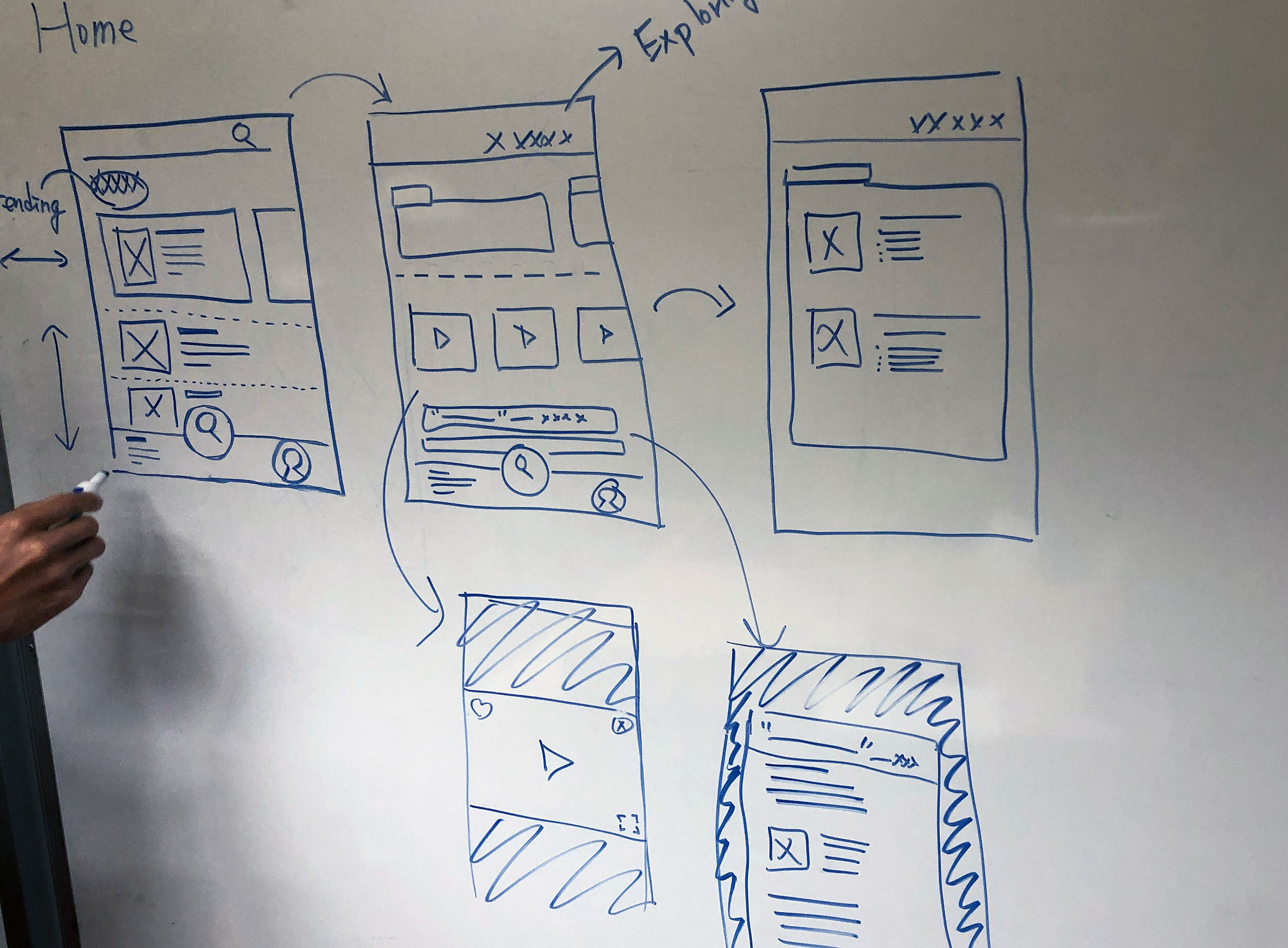
Flows
Flows by Hou.
Zephyr Swart
User Research
Interaction Design
Service Design